The Crystal Goblet: Book Review
Buying classic books on typography and design is a particular passion of mine. Come to any Zoom call with me and you’ll see numerous publications on bookshelves behind me.
One favourite read is The Crystal Goblet: Sixteen Essays on Typography, by Beatrice Warde. I bought it many years ago from a second-hand book shop in London, I forget which one sadly, and I referred to it again after going to the Beatrice Warde Memorial Lecture last October. Each year, the St Bride Foundation in London run a lecture that has a feminist and gender theme, and the speakers were Professor Teal Triggs from the Royal College of Art and Sîan Cook from the no star agency talking about their work at the Women’s Design + Research Unit (WD+RU) which was founded in 1994 with the intent of raising awareness about women working in the field of design education. The theme was ‘The Refuse To Keep Quiet’. It was a fantastic lecture, I’m a huge advocate for hidden voices and there are many in design, particularly drawing offices and printing presses.
Who was Beatrice Warde?
Beatrice Warde (1900–1969) was a writer, lecturer, historian and expert on typography, as well as marketing manager for Monotype. Famously she applied for the job under the pseudonym ‘Paul Beaujon’ and wrote first edition of The Crystal Goblet in this name too.
“Well, I wanted a pen name. I wasn’t quite sure at that time (which is a long time ago) that women would be taken quite as respectfully. I thought that if I was going to have a pen name, I might as well have a man, and I took a Frenchman’s at that, to make it a little more mysterious.” Listen to the full interview over on Typeradio, and read a transcript on Eye Magazine.
It’s almost certainly the most well-thumbed book in my library whenever I want to explain fonts or typography; there’s almost always a phrase from Warde that’s relevant to my work. She pioneered the way for gender equality in a very male-dominated space where women were employed in binderies (stitching books) and reception.
The key essay in the book, which gives it the title, is ‘The Crystal Goblet (or Printing should be invisible)’. Warde argues for a quiet and unobtrusive form of typography that reveals rather than obscures meaning.
Warde explains that: “The type which, through any arbitrary warping of design or excess of ‘colour’, gets in the way of the mental picture to be conveyed, is bad type. Our subconsciousness is always afraid of blunders (which illogical setting, tight spacing and too-wide unleaded lines can trick us into), of boredom, and of officiousness. The running headline that keeps shouting at us, the line that looks like one long word, the capitals jammed together without hair spaces — these mean subconscious squinting and loss of mental focus.”
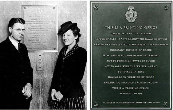
This is a Printing Office
Warde is also famous for these words, which also hang in a frame in my house:
This is a Printing Office
Crossroads of civilization
Refuge of all the arts
Against the ravages of time
Armoury of the fearless truth
Against whispering rumor
Incessant trumpet of trade
From this place, words may fly abroad
Not to perish on waves of sound
Not to vary with the writer’s hand
But fixed in time, having been verified in proof
Friend, you stand on the sacred ground:
This is a Printing Office
Originally printed in 1932
Warde’s approach is still incredibly relevant to the problems of social media design and high-churn content and shows exactly why a type specialists and designers are worth their talent - they make the reader engage with the work by using type well. I call it stealth design. In fact, I find this a Printing Office an incredibly moving piece of writing; it’s a call to arms and activism.
Further reading
Woman In Type is a project created by the University of Reading.